Showing posts with label Double page spread. Show all posts

Thursday, 10 February 2011

Double Page Spread Mock Up.


For this double page spread I like the use of the one photo for the background, and I think the white title links in well with the artists shirt. However, the image doesn't leave much room for the actual article, as I didn't want to type over the artist, so this is something I will have to think about. Some parts of the text are also not visible, so I will have to change the colour of my text or change the background to make it visible, and easier to read. I also need to include page numbers at the bottom of my pages so that the readers know where they are in the magazine. The page looks a little bare, so I think I should include another colour as well. The lack of text is something else I need to address, maybe moving the text and quote boxes around so that my page looks though it has more information to offer.


I think this double page spread looks quite boring compared to the other two, as there isn't as much going on. I think that the text could be broken up by one of the quotes to make it look less 'wordy'. The text in the right hand column also overlaps the center of the page, which would make it impossible for the readers to read, so I need to think about where everything is going to go so that it all fits on the page, and it is all visible. I could add another colour to the colour palette to make the page stand out more, and look more interesting. Adding a small quote, or a small sentence to introduce the article, could be fitted under the title to make it look more professional. Page numbers are also required.


I like this double page spread because it has a picture of the featured artist for the background, which is what I want to use for my magazine, but you can also read the article quite easily as well. For the title, quote and 'Exclusive Interview' I should use a bolder font to make them more visible,  and possibly have the quote in black as it is hard to read in the present colour. I like having 'Exclusive Interview' down the side of the page, it makes the article look more important. The text on the left hand side needs to be more clearly separated, because at the moment that block of text looks like a lot of reading, so if it's separated it would make the amount of text look less 'intimidating'.

Wednesday, 9 February 2011

Peer Evaluation.

From the comments and feedback I have received on my posts in relation to my mock ups, I think there are some elements that I need to take into consideration when creating my magazine. My first comments are on my front cover mock ups, where the minimalist look was liked, but I hadn't got my proportions correct, so this is something I must pay attention to when creating my magazine. Using more colour, rather than just having black and white, was also suggested in relation to my first cover mock up, so I will have to add another colour to my colour palette to make my magazine look interesting.


My choice of artist was also praised, they were considered to fit my magazine's music genre well. I am pleased with this because my model was my first choice to be my artist, and my target audience also like the image she presents.


My double page spread article was good, but needed more information as it wasn't very long. Therefore for my final magazine I will have to write more in for my article to make it look realistic, as it needs to fill the whole page to look convincing. To do this I should include more questions in the interview, add extra information to my introduction and make my artists responses to the questions longer. I could also give more information on the places that my artist went whilst on tour.


My first contents mock up received mixed reviews. The photo I had used contained a different model to the one I was planning to use, and they were not right for the genre of music. In my magazine I will have to refrain from using that person, or take another picture of them that will fit the genre of music my magazine features. However, my colour scheme, blue, white and black, was liked by my peers, and they thought it looked effective. It was suggested that I could use another colour, as the page looked quite bare, plus the blue element was liked, so I won't be getting rid of that colour, more just adding an extra one to my palette. It was also suggested that I add some more text to the page, as the lack of writing made the page look unrealistic, so in my final contents page I will include more text to make my magazine look more professional.

Artist Photos.


These are the photo's I took for my draft magazine, where all the photos, bar one, are of my artist. The first two photos are photos that I took to create an album cover, and the rest of the images are for my front cover, contents and double page spread.

Double Page Spread - Draft.

Double Page Spread Article - New.


Saturday, 18 December 2010

Kerrang Magazine, Double Page Analysis.


The double page spread has a colour scheme of black, white and red, which makes the page look quite dark, possibly reflecting the genre of music it contains. The page contains 4 black and white photos of the artists complying music together and performing their music, showing that the artists have worked hard to produce their music, maybe showing that they are soon to release a new album/single. The white banner on the right hand side of the page gives the readers information about the new tracks that the artists have created. It stands out against the dark photos and black background, and therefore draws the readers attention to it, as this is what the article is all about. Having the phrase 'World Exclusive' in the top left hand corner tells the readers how important the article is, and how well known the band is across the world, therefore making the magazine look good as it associates itself with such big musical artists. The title/quote has been written in two different colours, it gives the article variety, and makes the important part of the quote 'the best MCR' stand out. It lets the readers know that the band is getting better all the time, hence the reason that this new music is the best they have ever made so far. The text is split up into two columns, larger than other columns I have seen in magazines, but still not big enough to make the article look boring, with too much text.

I like the use of the two colours for the masthead as I think it makes, arguably, the most important part of the page, stand out and look interesting. It allows the magazine to draw attention to the part of the quote which they think is the most important, as it works well. I would consider using this in my magazine as I think it is a subtle way to make things stand out and is a useful element.

Friday, 17 December 2010

NME Magazine, Double Page Analysis.


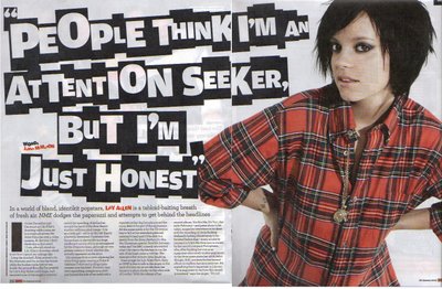
NME's double page spread contains just one photo of the subject of the article and the rest of the space is devoted to the text and title. The artists clothes match the pages colour scheme, red, black and white, this makes the whole page tie/link in together. The red text in the article is used to highlight who the article is about and who wrote it, letting the readers know who helped to create the article, and makes the two individuals seem important. The title is complied of white letters on individual black squares, all different sizes, but using the same font. The title is spread across both pages, and this links the photo in with the article as it shows that they are part of the same thing, as both take up space on both pages. The title looks different and original, and it grabs people's attention, which contradicts the title which quotes 'People think I'm an attention seeker, but I'm just honest'. The artist seems to be trying to defend herself, and denies trying to seek attention, but this is the exact opposite of what the title does, the title stands out and draws the readers attention. Also the colour of clothing the artist is wearing in the photo is loud and bright, and stands out against the white background, once again drawing the attention to her. The article itself is split up into small pieces and put into 4 columns, which makes the reader think that there isn't much text there, and it will be a quick read, making them more willing to read the article. It is dwarfed slightly by the overlarge image and title, as it is not a key element that would be used to grab the readers interest, and therefore is seen to be less important.

I like the white background that is used on this double page spread, as I think it is effective in making the important pieces on the page to stand out, and looks quite clean and pleasing to the eye. However, if there wasn't such a large title and bright picture I think that the background would make the article look quite bland, as there wouldn't be much colour and therefore people would be less interested in reading it. Consequently I think in my magazine I would only use a white background for my double page spread if I were using a brightly coloured image/text.

Q Magazine, Double Page Spread Analysis.


This double page spread is split into two sections, the photo which is spread across the two pages, and the actual article, which is written on top of the photo. The image used is of the artist vandalising on a wall which is already covered in graffiti. This shows the readers that the artist is someone who maybe got into trouble a lot before his fame, and the images of the alcohol bottles would support this, as the artist is wearing stylish clothing representing that he is quite young, so the reference to the beer bottles could symbolise that he had been involved in partying and drinking. The image of the stereo would link to the artist having enjoyed listening/creating music and is also relevant to the idea of a partying image, and could show that the artists music is something that people would play at a party, and therefore it is quite 'fashionable' music. Having the large text at the top of the page for the title makes it stand out from the rest of the page and grab the readers attention. It makes the article look more interesting, and hence would make people more willing to read it. The text has been split into 4 small columns, which makes it look as if there isn't much text, and stops the page from looking 'essay-like' and more interesting to read.

I like how the double page spread includes other images at the bottom of the text, as I think this would help to reflect the artist/genre of music really well, and images can sometimes make or present an idea better than words can. It also makes the page more interesting to look at, and would therefore make people more willing to read the article. However, having more images on the page could make it look cluttered if you have too many, or there is also a lot of text, and this would put people off from reading the article as it would look like too much effort.