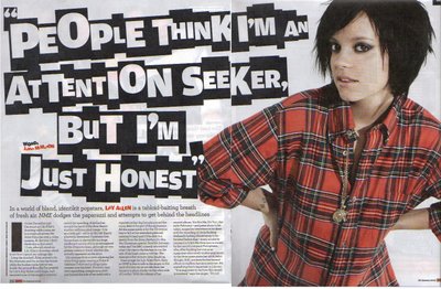
NME's double page spread contains just one photo of the subject of the article and the rest of the space is devoted to the text and title. The artists clothes match the pages colour scheme, red, black and white, this makes the whole page tie/link in together. The red text in the article is used to highlight who the article is about and who wrote it, letting the readers know who helped to create the article, and makes the two individuals seem important. The title is complied of white letters on individual black squares, all different sizes, but using the same font. The title is spread across both pages, and this links the photo in with the article as it shows that they are part of the same thing, as both take up space on both pages. The title looks different and original, and it grabs people's attention, which contradicts the title which quotes 'People think I'm an attention seeker, but I'm just honest'. The artist seems to be trying to defend herself, and denies trying to seek attention, but this is the exact opposite of what the title does, the title stands out and draws the readers attention. Also the colour of clothing the artist is wearing in the photo is loud and bright, and stands out against the white background, once again drawing the attention to her. The article itself is split up into small pieces and put into 4 columns, which makes the reader think that there isn't much text there, and it will be a quick read, making them more willing to read the article. It is dwarfed slightly by the overlarge image and title, as it is not a key element that would be used to grab the readers interest, and therefore is seen to be less important.
I like the white background that is used on this double page spread, as I think it is effective in making the important pieces on the page to stand out, and looks quite clean and pleasing to the eye. However, if there wasn't such a large title and bright picture I think that the background would make the article look quite bland, as there wouldn't be much colour and therefore people would be less interested in reading it. Consequently I think in my magazine I would only use a white background for my double page spread if I were using a brightly coloured image/text.
No comments:
Post a Comment