The Golden Spiral was in fact something that was first discovered by Pythagoras. In geometry, the golden spiral is a logarithmic spiral whose growth factor b is related to φ (the golden spiral ratio). The Golden Spiral was firstly derived from the 'golden rectangle'; a unique rectangle with a golden ratio. When you connect a curve through the corners of these rectangles, that is when the golden spiral is created. To be specific the golden spiral gets wider by a factor of φ for every quarter turn that it is making.
Therefore, this means that the spiral shows us where the eyes are drawn first and the place that people automatically find most pleasing. If the theory was to be put in relation to photography it would seem that the centre of the spiral is where the main focus of the image is. As the spiral moves away from the centre, this is moving away from the point of focus to smaller details that people do not notice as much. I will have to test this out on several of my tests shot to ensure that the golden spiral theory works with my photographs and consequently make them more aesthetically pleasing.
Showing posts with label Research. Show all posts
Showing posts with label Research. Show all posts
Wednesday, 19 January 2011

Audience Profile.
My target audience is going to be teenagers between the ages of 14-19, who are interested in music, but mainly the genre of Indie music. I think my magazine would lean more towards teenage girls as I can relate to that group more than others, and therefore I find it easier to advertise my magazine to them. Here is some information on the type of person who would fit into my target audience:

This is Jemma :) She's 17 and lives in Braunstone, Leicester. She goes to Lutterworth College where she is currently taking her A-levels which include: media studies, english literature, english language and food technology. I have chosen to use Jemma as an example of my target audience because she is in the middle of my age range and listens to the genre of music I am featuring in my magazine. As well as listening to indie artists such as Snow Patrol and Kate Nash, she also listens to 'soft rock' like Coldplay and Muse. As this is the main aim I am going for in my magazine it makes Jemma fit into my target audience easily. Jemma gets her music from sites such as Spotify, and is a regular user of her iPod, and consequently uses iTunes frequently.
Jemma likes to spend her time with her friends, whether going out or just spending some time talking. This gives her a chance to share similar interests, which is a quality I am looking for in my target audience, as this would help boost magazine sales. Her clothes tend to be items that she feels comfortable in, but she also likes items with a 'quirky' streak, such as tops with moustaches on. My magazine is going to include a similar streak of difference via clothes, which should hopefully interest more people in my target audience.
Jemma feels that a music magazine should contain interviews with artists, information about up-coming artists, articles about new albums/singles, and any other pieces that would be relevant to the genre of music she is interested in.
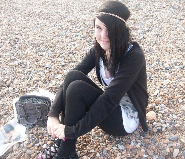
This is Jemma :) She's 17 and lives in Braunstone, Leicester. She goes to Lutterworth College where she is currently taking her A-levels which include: media studies, english literature, english language and food technology. I have chosen to use Jemma as an example of my target audience because she is in the middle of my age range and listens to the genre of music I am featuring in my magazine. As well as listening to indie artists such as Snow Patrol and Kate Nash, she also listens to 'soft rock' like Coldplay and Muse. As this is the main aim I am going for in my magazine it makes Jemma fit into my target audience easily. Jemma gets her music from sites such as Spotify, and is a regular user of her iPod, and consequently uses iTunes frequently.
Jemma likes to spend her time with her friends, whether going out or just spending some time talking. This gives her a chance to share similar interests, which is a quality I am looking for in my target audience, as this would help boost magazine sales. Her clothes tend to be items that she feels comfortable in, but she also likes items with a 'quirky' streak, such as tops with moustaches on. My magazine is going to include a similar streak of difference via clothes, which should hopefully interest more people in my target audience.
Jemma feels that a music magazine should contain interviews with artists, information about up-coming artists, articles about new albums/singles, and any other pieces that would be relevant to the genre of music she is interested in.
Monday, 17 January 2011
Magazine Covers - Artistic.

This magazine front cover is very artistic in the way that it is void of colours and seems to be completely drawn, which is something not usually used on music magazines, because they tend to stick to the idea of using a photograph. Even though the image looks as if it has been drawn on, the whole page looks 'seemless' as it all fits together easily. The use of no colour in the image makes it look more interesting and allows the bottom part of the magazine to stand out more clearly as the colours would jump out off the page. The image could be seen as a type of parody, because the way the two women have been drawn is not what would be considered flattering, and it tries to make them look silly. The magazine could be trying to portray that not everyone is as perfect as models usually used on the cover of magazines, and therefore allowing people to see that they don't focus on perfection in their magazine.

In this edition of Interview colours are relied on very heavily to make the magazine stand out. The use of the colours makes the magazine look very bright and vibrant, which is very eye-catching and would look more interesting to people than other, duller, magazine covers. The colours could also be used to signify the fact that Rihanna is considered to be a colourful character, or that her music is very bright and lively. It also makes the masthead stand out on the page as the white font contrasts to the bright colours used and therefore makes it easier to read. Similarly, the black font on the cover ties in with the black of Rihanna's outfit, but at the same time stands out from the bright colours, making it easier to see/read. Having the flowers gives the image a slight edge of innocence, which is a connotation people usually make with flowers, but it could also give the idea of seduction, which would tie in with Rihanna's pose and expression.Colour is used predominantly to gain interest, and I think the magazine uses this technique very well.

This is another magazine front cover that relies on colour to make it stand out against other magazines. The pink lighting ties in with the pink font, mainly used for the masthead, and is included in the magazines colour palette. The blue lighting contrasts with the pink lighting, giving the effect that the artist has two sides, which the magazine has represented by using the two different colours. The background colour contrasts with the image and makes the image seem brighter and vibrant. The pastel colours also makes the image stand out, but also makes the text easy to read and clear to see.
Saturday, 18 December 2010
Moodboard - Animoto.
This animoto includes images which show what kind of clothing style that my main image should be wearing, colours schemes that are associated with the genre, accessories I should have, what poses I should have my model in and generally what kind of style indie music is consider to be.
Kerrang Magazine, Double Page Analysis.

The double page spread has a colour scheme of black, white and red, which makes the page look quite dark, possibly reflecting the genre of music it contains. The page contains 4 black and white photos of the artists complying music together and performing their music, showing that the artists have worked hard to produce their music, maybe showing that they are soon to release a new album/single. The white banner on the right hand side of the page gives the readers information about the new tracks that the artists have created. It stands out against the dark photos and black background, and therefore draws the readers attention to it, as this is what the article is all about. Having the phrase 'World Exclusive' in the top left hand corner tells the readers how important the article is, and how well known the band is across the world, therefore making the magazine look good as it associates itself with such big musical artists. The title/quote has been written in two different colours, it gives the article variety, and makes the important part of the quote 'the best MCR' stand out. It lets the readers know that the band is getting better all the time, hence the reason that this new music is the best they have ever made so far. The text is split up into two columns, larger than other columns I have seen in magazines, but still not big enough to make the article look boring, with too much text.
I like the use of the two colours for the masthead as I think it makes, arguably, the most important part of the page, stand out and look interesting. It allows the magazine to draw attention to the part of the quote which they think is the most important, as it works well. I would consider using this in my magazine as I think it is a subtle way to make things stand out and is a useful element.
Friday, 17 December 2010
NME Magazine, Double Page Analysis.
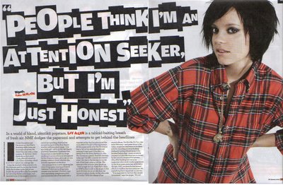
NME's double page spread contains just one photo of the subject of the article and the rest of the space is devoted to the text and title. The artists clothes match the pages colour scheme, red, black and white, this makes the whole page tie/link in together. The red text in the article is used to highlight who the article is about and who wrote it, letting the readers know who helped to create the article, and makes the two individuals seem important. The title is complied of white letters on individual black squares, all different sizes, but using the same font. The title is spread across both pages, and this links the photo in with the article as it shows that they are part of the same thing, as both take up space on both pages. The title looks different and original, and it grabs people's attention, which contradicts the title which quotes 'People think I'm an attention seeker, but I'm just honest'. The artist seems to be trying to defend herself, and denies trying to seek attention, but this is the exact opposite of what the title does, the title stands out and draws the readers attention. Also the colour of clothing the artist is wearing in the photo is loud and bright, and stands out against the white background, once again drawing the attention to her. The article itself is split up into small pieces and put into 4 columns, which makes the reader think that there isn't much text there, and it will be a quick read, making them more willing to read the article. It is dwarfed slightly by the overlarge image and title, as it is not a key element that would be used to grab the readers interest, and therefore is seen to be less important.
I like the white background that is used on this double page spread, as I think it is effective in making the important pieces on the page to stand out, and looks quite clean and pleasing to the eye. However, if there wasn't such a large title and bright picture I think that the background would make the article look quite bland, as there wouldn't be much colour and therefore people would be less interested in reading it. Consequently I think in my magazine I would only use a white background for my double page spread if I were using a brightly coloured image/text.
Q Magazine, Double Page Spread Analysis.

This double page spread is split into two sections, the photo which is spread across the two pages, and the actual article, which is written on top of the photo. The image used is of the artist vandalising on a wall which is already covered in graffiti. This shows the readers that the artist is someone who maybe got into trouble a lot before his fame, and the images of the alcohol bottles would support this, as the artist is wearing stylish clothing representing that he is quite young, so the reference to the beer bottles could symbolise that he had been involved in partying and drinking. The image of the stereo would link to the artist having enjoyed listening/creating music and is also relevant to the idea of a partying image, and could show that the artists music is something that people would play at a party, and therefore it is quite 'fashionable' music. Having the large text at the top of the page for the title makes it stand out from the rest of the page and grab the readers attention. It makes the article look more interesting, and hence would make people more willing to read it. The text has been split into 4 small columns, which makes it look as if there isn't much text, and stops the page from looking 'essay-like' and more interesting to read.
I like how the double page spread includes other images at the bottom of the text, as I think this would help to reflect the artist/genre of music really well, and images can sometimes make or present an idea better than words can. It also makes the page more interesting to look at, and would therefore make people more willing to read the article. However, having more images on the page could make it look cluttered if you have too many, or there is also a lot of text, and this would put people off from reading the article as it would look like too much effort.
Thursday, 16 December 2010
Kerrang Magazine, Contents Analysis.

Kerrang's contents page uses the same colour palette that is featured on their front page, with the added addition of the colour yellow, which is the same in nearly every issue. The colours are usually associated with danger, when shown together, and this could reflect the genre of music the magazine features, that it's a bit rebellious and mainly focuses on rock music The first one third of the page is taken up by one large picture with smaller pictures on the layer on top of it, as well as the title 'Contents', the issue number, and the cover date. The smaller two of the three pictures seem to be pictures of articles in the magazine, that as coupled with the article title and page number. The main photo is of an artist signing autographs, and the text at the bottom corner of the picture informs the readers that the photo is of 'Bring Me The Horizon'. The text is on the right hand side of the page number, which is written differently to the other page numbers in the top third of the page. The number is written in white on top of a black star inside red circle, and this shows that the article must be something different/important, as the star symbol in the media institution is commonly associated with people would are important/famous, hence VIPs. The rest of the contents page seems to be split evenly between the amount of textual information and the amount of photos making the page look more interesting to read. There is a black banner at the top of the information, just under the main photo, with the magazine title and the words 'This Week', again showing the readers that the magazine is published every week should they wish to purchase it again.
On the left hand side there is a photo of the magazine's editor, and a small column of writing about Biffy Clyro, and the offer which will be in the next issue. The beginning of the text starts off in bold lettering, making the words stand out, and letting the readers know that there is a bit of information about Biffy Clyro, should they be interested. The other three photos that are on the rest of the page are pictures that advertise different music, there is an album cover, a picture of an artist and a bands 'logo', all of which tell the readers not only what is featured in the magazine, but it also gives them extra information, as they readers will know be able to recognise the artist having seen a picture, something that they may not have been able to do beforehand. The text is split into 4 columns and then categorised in 8 different categories, which lets the readers find information they are interested in easily. The black star inside the red circle also appears frequently and announces which articles are the ones that were featured on the front cover, letting the readers known where the articles, that may have persuaded them to buy the magazine, are. The page also has a small box advertising the chance to subscribe to the magazine in the bottom right hand corner, accompanied by three photos of different Kerrang issues, which allows the readers to see what sort of thing they would gain if they did subscribe.
The use of the main photo in the top one third of the page is an aspect of the front cover that I like, and having a picture of another band/artist I will have included in my magazine is an element I want to add. I think the use of this makes the contents page look more appeakling to the readers as people generally prefer to look at pictures than read text, and adding pictures to my contents page would satsify these needs.
NME Magazine, Contents Analysis.

The banner at the top of the page includes the magazine title and the date on which NME issue was released, and as the magazine promotes 'NME This Week', it tells the readers that there is a new edition released every week, and they may therefore go and buy the magazine next week if they enjoy reading it, as they now know how many times it is released and when. The contents page is quite busy, and textual, as it has writing everywhere except for in the middle, where a medium sized picture is shown and there isn't an blank spaces or many gaps to break up the text. The main picture is accompanied by a small piece of information that is in bigger text than the writing surrounding it, giving the readers some extra information about UK gigs and tours, and how they were received/reviewed. The bigger text draws attention to the information, and makes the readers think that they are getting more than they paid for, as not many music magazine have this sort of information on the contents page On the left hand side of the page there is a column of red text that goes all the way down the page, which is the band index. It lists all the bands that are featured in the magazine and on which page people will be able to find them, allowing the readers to find bands that interest them and read that article with little effort, as they don't have to go through the whole magazine to look for artists that may interest them. The fact that the list is in red text makes it stand out from the rest of the page, and in respect, boasts and advertises the fact that there is a band list to make the reading more enjoyable. The right hand side of the page shows all the important articles in the magazine, and each one has been categorised into different aspects in which they fit. This would help the audience to look at the articles in which they are more interested in, each of the 5 categories are about different things, and therefore if the reader wanted to look at the review of a new music album it would be easy for them to find it. The contents page also includes little arrows to highlight the articles that were featured on the front page, making it easier to find articles that may have compelled the reader to buy the magazine. There is also a box of information at the bottom of the page that gives the reader the option to subscribe to the magazine, and how they would do it. The text is in a yellow font because it helps draw attention to the advert and the magazine would orefer people to subscribe to their magazine.
I think that the idea of indicating which articles are featured on the front cover is a good way of letting the readers find the articles they were interested in easily, however I wouldn't use black arrows like NME have done, because I think it makes the contents page look a little depressing and bland, and the look of the page would benefit more from brighter coloured arrows.
Q Magazine, Contents Analysis.

I like how under all the articles Q have put a little bit of information about each one, and in some cases opinions about what the magazine thinks. I think this a really orginal way of making the contents page more than just an index, as it gives the page a bit more of a personality, and makes the readers enjoy it more. This is in an element I would be happy to include in my magazine.
Monday, 13 December 2010
NME Magazine, Front Cover Analysis.
NME Front Cover Analysis
Cost
NME magazine costs £2.20 for each issue, which is cheaper than the other two music magazines I have analysed. Because the cost of NME is much lower than other music magazines, it would encourage more people to buy the magazine and therefore if more people buy the magazine than the bigger profit the company makes. The price would help it to sell as people are more willing to buy something that is as good quality as the more expensive music magazines, but compared to the other magazines, is much cheaper.
Coverlines
The use of hyperbole on the front cover of NME magazine makes potential readers think that NME has the best music, and interviews with the bands that are at the top of the music industry at the moment 'Top 25 bands making America cool again'. This makes NME seem like it has information about 25 bands which are fashionable at the time and the British music industry is greatly influenced by American artists, and therefore the bands that are making America 'cool again' would be more interesting to a younger audience than other types of music, such as classical. However the likelihood that these bands, on their own, are making America cool is very unlikely, and therefore the magazine has exaggerated, and made their content sound much more exciting and interesting than it probably is. The front cover doesn't use direct address in their coverlines, but one of the artists in the main image is looking directly into the camera, and this gives the impression that he is looking right at you. This would draw the readers to look at the magazine as the photo is an invitational photo, there is a lot of emphasis on their eyes, which are looking into the camera and they are half turned towards the camera with a small smile. It invites potential buyers to look more closely at the magazine, because when someone is caught looking at you it generates interest, and this factor is relied on for the front cover.
Target Audience
NME's main audience for this issue would be teenage girls, as the colour palette and style indicates something that would appeal more to teenage girls than boys. The main image is also a close up of two young male artists, which when on a shelf would attract girls attention more than guys because they would be more interested, as generally it is thought that girls listen to male artists rather than female artists. The 'We love USA' element is more fashionable rather than music orientated, which would appeal to teenage girls because they would be more interested as it involves what is in fashion, which is something teenage girls are stereotypically 'obsessed' with.
From NME's front cover I like the idea of using the font for the title and nothing else, as I think it makes the magazines name stand out from all other text, and this is important for a magazine as it helps people to remember the name, and therefore able to buy it again. But this idea could make the front cover look slightly bland as only two texts would be used for the rest of the text and this could make it looking boring, as there isn't much diversity.
Cost
NME magazine costs £2.20 for each issue, which is cheaper than the other two music magazines I have analysed. Because the cost of NME is much lower than other music magazines, it would encourage more people to buy the magazine and therefore if more people buy the magazine than the bigger profit the company makes. The price would help it to sell as people are more willing to buy something that is as good quality as the more expensive music magazines, but compared to the other magazines, is much cheaper.
Coverlines
The use of hyperbole on the front cover of NME magazine makes potential readers think that NME has the best music, and interviews with the bands that are at the top of the music industry at the moment 'Top 25 bands making America cool again'. This makes NME seem like it has information about 25 bands which are fashionable at the time and the British music industry is greatly influenced by American artists, and therefore the bands that are making America 'cool again' would be more interesting to a younger audience than other types of music, such as classical. However the likelihood that these bands, on their own, are making America cool is very unlikely, and therefore the magazine has exaggerated, and made their content sound much more exciting and interesting than it probably is. The front cover doesn't use direct address in their coverlines, but one of the artists in the main image is looking directly into the camera, and this gives the impression that he is looking right at you. This would draw the readers to look at the magazine as the photo is an invitational photo, there is a lot of emphasis on their eyes, which are looking into the camera and they are half turned towards the camera with a small smile. It invites potential buyers to look more closely at the magazine, because when someone is caught looking at you it generates interest, and this factor is relied on for the front cover.
Target Audience
NME's main audience for this issue would be teenage girls, as the colour palette and style indicates something that would appeal more to teenage girls than boys. The main image is also a close up of two young male artists, which when on a shelf would attract girls attention more than guys because they would be more interested, as generally it is thought that girls listen to male artists rather than female artists. The 'We love USA' element is more fashionable rather than music orientated, which would appeal to teenage girls because they would be more interested as it involves what is in fashion, which is something teenage girls are stereotypically 'obsessed' with.
From NME's front cover I like the idea of using the font for the title and nothing else, as I think it makes the magazines name stand out from all other text, and this is important for a magazine as it helps people to remember the name, and therefore able to buy it again. But this idea could make the front cover look slightly bland as only two texts would be used for the rest of the text and this could make it looking boring, as there isn't much diversity.
Saturday, 11 December 2010
Kerrang Magazine, Front Cover Analysis.
Kerrang Front Cover Analysis
Cost
The usual cost of Kerrang is around £3.20, which is slightly cheaper than other music magazines I have looked at, and therefore that on it's own may incline more people to buy it, just because they have to spend a little less money, but gain around the same amount of information. Considering that Kerrang also gives out posters in every edition the price is quite reasonable as you'd spend about the same amount on just one poster from stores.
Language
The language used on the front cover is also quite informal, but the front cover relies more on images than words to sell themselves, and the writing they do use is mainly just artists names that are featured in the magazine. Because there is not much writing on the front could appeal to teenagers, as they'd rather not buy something that was very 'wordy' and the informal language makes people feel like they can relate to the magazine, and consequently making them more prone to buying the magazine.
Font
There are three different fonts used on the front cover of Kerrang, but each font seems to have also been assigned to a colour as well. All the green text is in the same font, all the white text (including the title) is in the same font, as is the red text. I think that all the white text is written in the same colour font as the title to highlight the things that are always included on the magazine, for example, the advertisement of '5 Free Posters!' is in the same font as the title, and as the title is on every edition of Kerrang, it would indicate that there are also always free posters in Kerrang as well. This would make people more likely to but Kerrang because they would be willing to gain the free posters, and would probably therefore continue buying the magazine for the posters. The font in which 'Green Day' is written in draws attention to it, as the rest of the writing in that font is relatively small, and therefore this jumps out because you don't see the other font straight away. It promotes the fact that the main feature is the article about Green Day, as not only is it in a different colour but also in a different font. The font makes the article stand out and when on the shelves people would notice it quickly and fans of Green Day would be interested in the article.
On the front cover of Kerrang I like how the magazine has linked the colour palette to the main image, the band members of Green Day, and used this to it's full effect. On my front cover I would have to use colours that compliment my main image, and that also can be associated with my genre of music. The magazine's name is another aspect that I like, as it really stands out, not only because it is onomatopoeic. I think the title is another good way of advertising the genre of music featured in the magazine, and I would consider using this in my magazine.
Cost
The usual cost of Kerrang is around £3.20, which is slightly cheaper than other music magazines I have looked at, and therefore that on it's own may incline more people to buy it, just because they have to spend a little less money, but gain around the same amount of information. Considering that Kerrang also gives out posters in every edition the price is quite reasonable as you'd spend about the same amount on just one poster from stores.
Language
The language used on the front cover is also quite informal, but the front cover relies more on images than words to sell themselves, and the writing they do use is mainly just artists names that are featured in the magazine. Because there is not much writing on the front could appeal to teenagers, as they'd rather not buy something that was very 'wordy' and the informal language makes people feel like they can relate to the magazine, and consequently making them more prone to buying the magazine.
Font
There are three different fonts used on the front cover of Kerrang, but each font seems to have also been assigned to a colour as well. All the green text is in the same font, all the white text (including the title) is in the same font, as is the red text. I think that all the white text is written in the same colour font as the title to highlight the things that are always included on the magazine, for example, the advertisement of '5 Free Posters!' is in the same font as the title, and as the title is on every edition of Kerrang, it would indicate that there are also always free posters in Kerrang as well. This would make people more likely to but Kerrang because they would be willing to gain the free posters, and would probably therefore continue buying the magazine for the posters. The font in which 'Green Day' is written in draws attention to it, as the rest of the writing in that font is relatively small, and therefore this jumps out because you don't see the other font straight away. It promotes the fact that the main feature is the article about Green Day, as not only is it in a different colour but also in a different font. The font makes the article stand out and when on the shelves people would notice it quickly and fans of Green Day would be interested in the article.
On the front cover of Kerrang I like how the magazine has linked the colour palette to the main image, the band members of Green Day, and used this to it's full effect. On my front cover I would have to use colours that compliment my main image, and that also can be associated with my genre of music. The magazine's name is another aspect that I like, as it really stands out, not only because it is onomatopoeic. I think the title is another good way of advertising the genre of music featured in the magazine, and I would consider using this in my magazine.
Q Magazine, Front Cover Analysis.
Q Front Cover Analysis.
Cost
Q magazine costs £3.99 normally, sometimes more depending on the content in each edition. Compared to other magazines this can be seen as quite a high price, but the magazine front cover, in a sense, tries to justify the price by advertising the amount of articles they include, all the different genres of music and the amount of 'exclusive' interviews. By putting so much information on the front cover, it shows people that they are getting good information, and good quality for the price which they're paying, making them more willing to buy the magazine.
Coverlines
The coverlines used on the front cover of Q use direct address '...you didn't know...', which draws people in as the magazine seems to be talking directly to them, and in this case, they therefore feel that because they don't know these things, they have to buy the magazine educate themselves in that topic. Q's coverlines also include a hyperbole 'Rock's Greatest Nutjobs'. They make it seem like the magazine has information on who is officially the greatest nutjobs in rock, whereas in reality it's probably just artists who are considered to be nutjobs. It makes the information seem more important than it actually is, and in effect, makes the magazine more important because they seem to have the 'best of the best' information.
Target Audience
The look of the magazine and the style of clothing that the artist wears in the main image, suggests that the magazine focuses on the rock genre as the colours and style are linked to rock. Also the fact that the magazine has quite a few interviews with well known rock bands, and boasts about knowing 'Rock's Greatest Nutjobs' adds to the idea that the magazine associates itself with rock more than any other genre of music. This could symbolise that the magazines main target audience is rock fans as it includes many articles and styles that would interest a person who enjoyed reading about rock music, but also rock music which would interest different ages, giving the magazine a wider target audience.
Out of this front cover I like the main image of Matt Bellamy using a guitar to smash the magazine title, as I think it looks really effective, and represents the genre of music the magazine features well. However, as I am thinking of using 'indie' music for the genre of my magazine, this type of image wouldn't conform to the genre of music, but I could consider having the main image interacting with the magazine title in some way. I also like the use of banners shown on Q's front cover and this is definitely an element I will be adding to my front cover, as not only does it look sophisicated, but it also helps to draw attention to the front cover and certain articles.
Cost
Q magazine costs £3.99 normally, sometimes more depending on the content in each edition. Compared to other magazines this can be seen as quite a high price, but the magazine front cover, in a sense, tries to justify the price by advertising the amount of articles they include, all the different genres of music and the amount of 'exclusive' interviews. By putting so much information on the front cover, it shows people that they are getting good information, and good quality for the price which they're paying, making them more willing to buy the magazine.
Coverlines
The coverlines used on the front cover of Q use direct address '...you didn't know...', which draws people in as the magazine seems to be talking directly to them, and in this case, they therefore feel that because they don't know these things, they have to buy the magazine educate themselves in that topic. Q's coverlines also include a hyperbole 'Rock's Greatest Nutjobs'. They make it seem like the magazine has information on who is officially the greatest nutjobs in rock, whereas in reality it's probably just artists who are considered to be nutjobs. It makes the information seem more important than it actually is, and in effect, makes the magazine more important because they seem to have the 'best of the best' information.
Target Audience
The look of the magazine and the style of clothing that the artist wears in the main image, suggests that the magazine focuses on the rock genre as the colours and style are linked to rock. Also the fact that the magazine has quite a few interviews with well known rock bands, and boasts about knowing 'Rock's Greatest Nutjobs' adds to the idea that the magazine associates itself with rock more than any other genre of music. This could symbolise that the magazines main target audience is rock fans as it includes many articles and styles that would interest a person who enjoyed reading about rock music, but also rock music which would interest different ages, giving the magazine a wider target audience.
Out of this front cover I like the main image of Matt Bellamy using a guitar to smash the magazine title, as I think it looks really effective, and represents the genre of music the magazine features well. However, as I am thinking of using 'indie' music for the genre of my magazine, this type of image wouldn't conform to the genre of music, but I could consider having the main image interacting with the magazine title in some way. I also like the use of banners shown on Q's front cover and this is definitely an element I will be adding to my front cover, as not only does it look sophisicated, but it also helps to draw attention to the front cover and certain articles.
Subscribe to:
Posts (Atom)